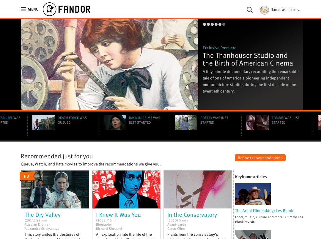
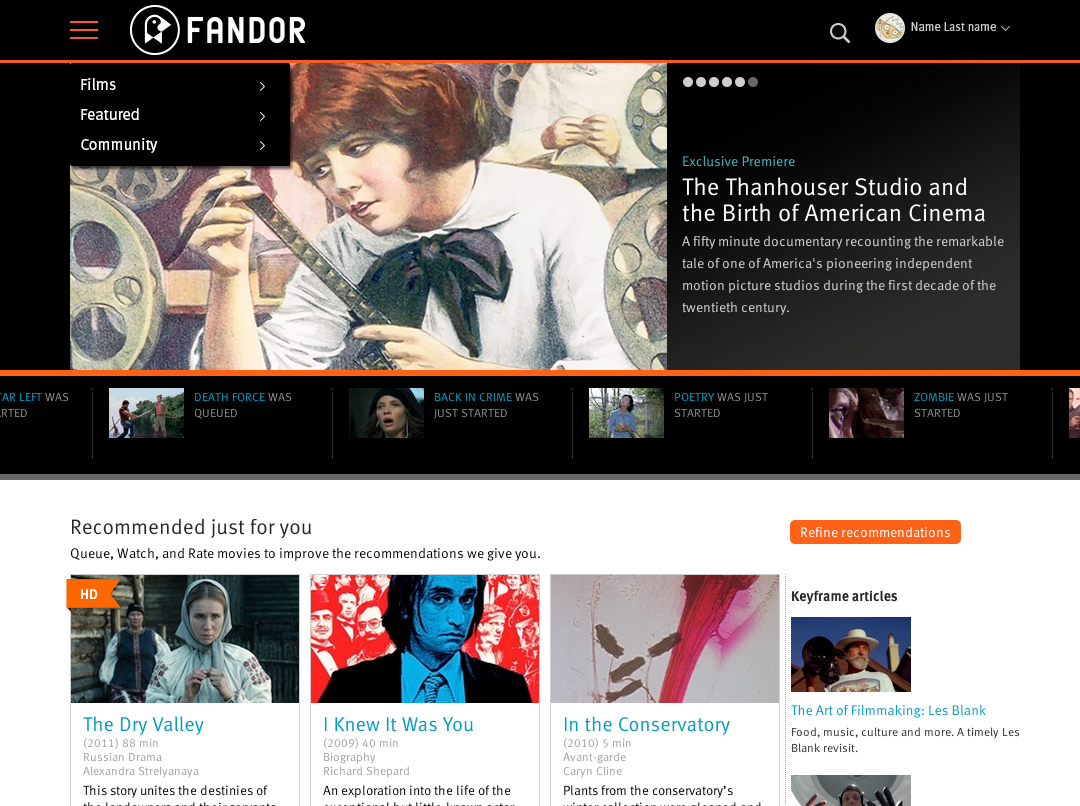
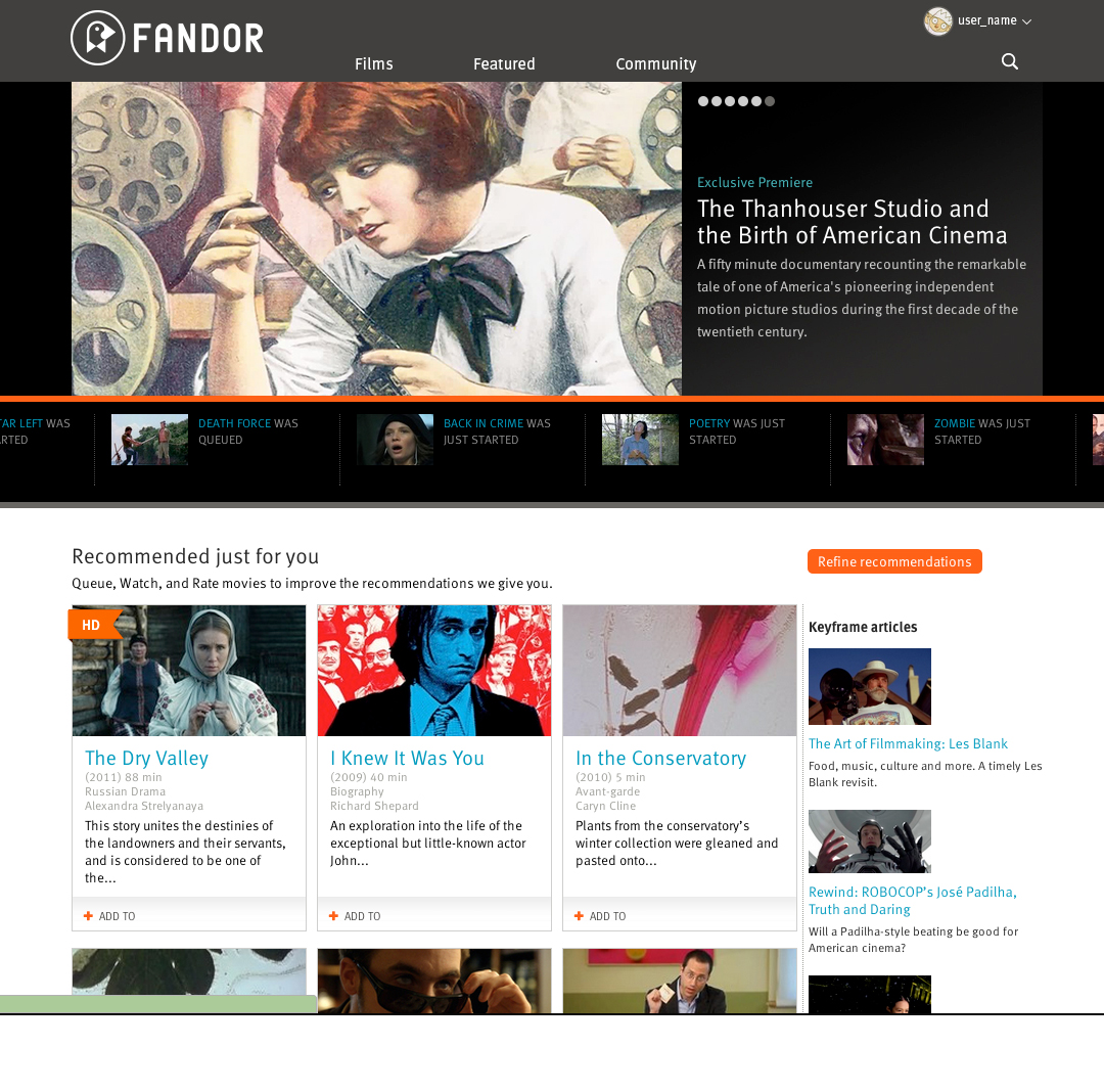
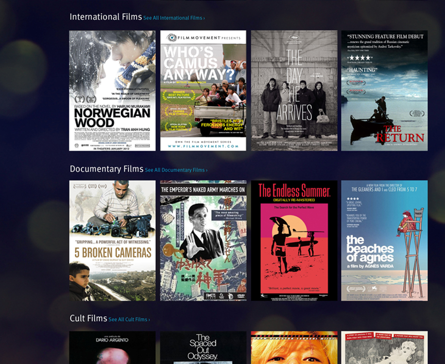
Fandor's Logged-in Home Page
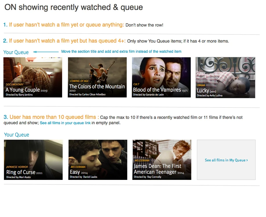
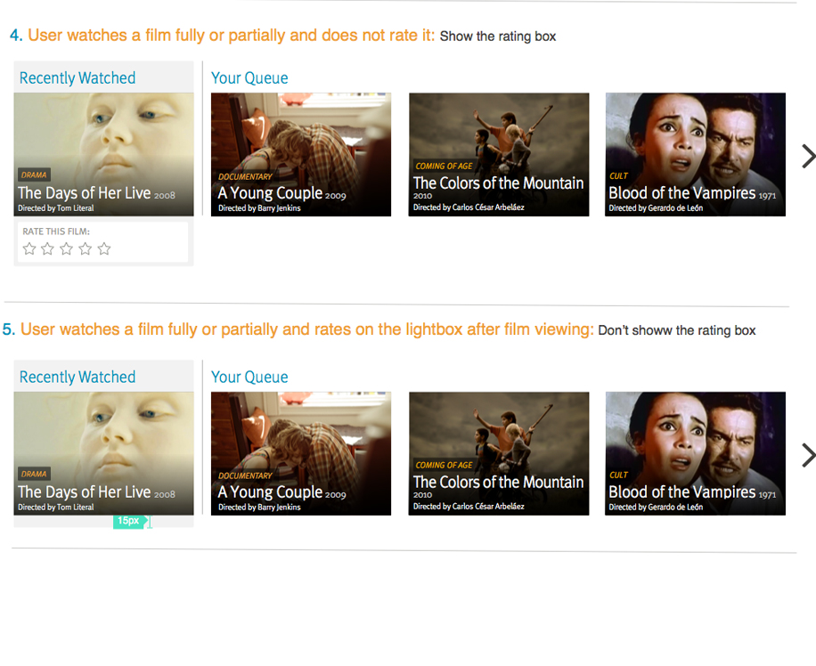
Fandor needed to make it easier for logged in members to access films that they are most likely to watch. The films and content surfaced in current page are broadly recommendations not specific to users.
Goal: Increase member activity for watching films, provide members with specific recommendations.
- Optimize experience for logged in members
- Make it easier to find a film to watch on this page
- Clearly differentiate content/recommendation types
Success Metrics: Increase views of films curated and recommended on homepage.
Process:
- Internal Research/Competitive Analysis
- Brain Storming / Crude Wireframes
- Prototyping
- Testing
- Final Design Delivery
Internal Research/Competitive Analysis
Brain Storming / Crude Wiereframes
Prototyping


Testing
High level goals
1. Validation of Information Architecture and Hierarchy of elements displayed
2. UX roadblocks - what’s not working
3. Feedback on aesthetics
Prioritized list of issues to address before development
Test 8 users: 5 existing members - 3 new users
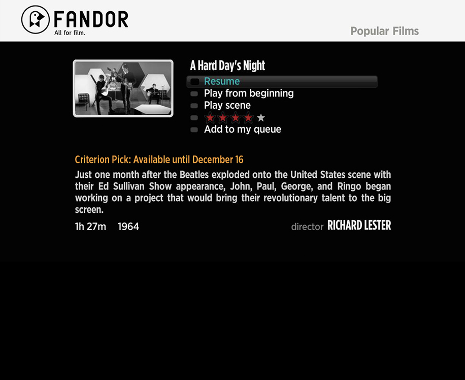
Test participants will attempt the completion of following tasks:
Using InVision Prototype
Tasks for Homepage
● Task 1: Explore the page and provide feedback of what you’re seeing
● Task 2: Explore the slider content and tell me what you see. What's new? Likes/Dislikes?
● Task 3: Ask them to get more info on a specific film, Hover over the title of the film…and provide feedback
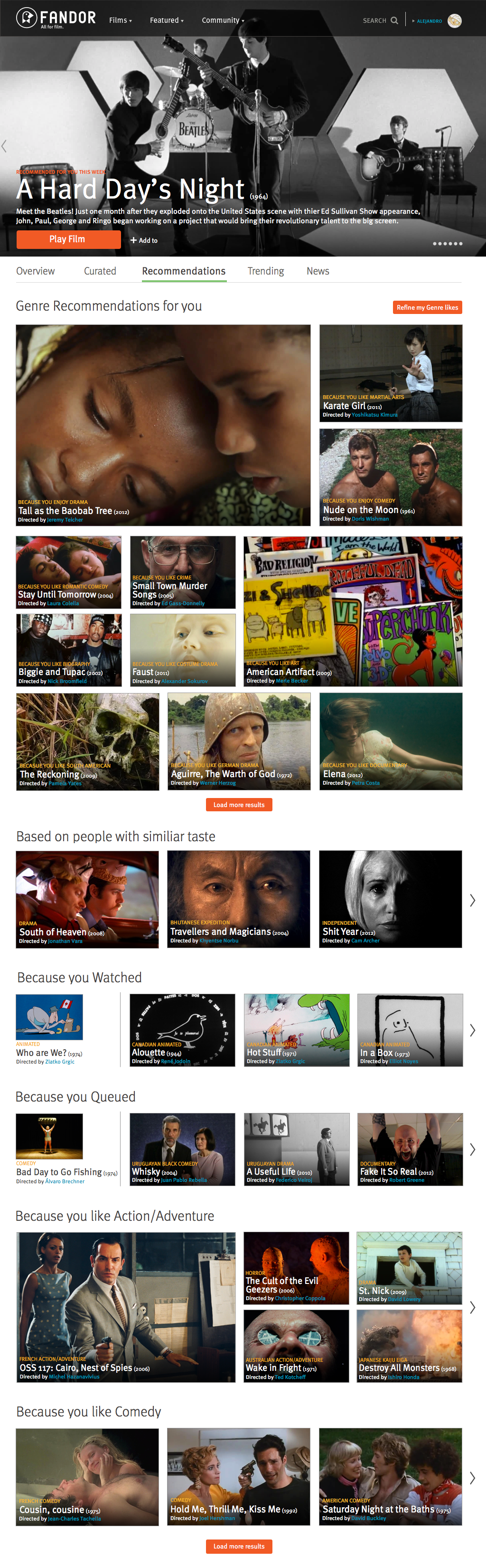
For the following tasks do in random order for different users
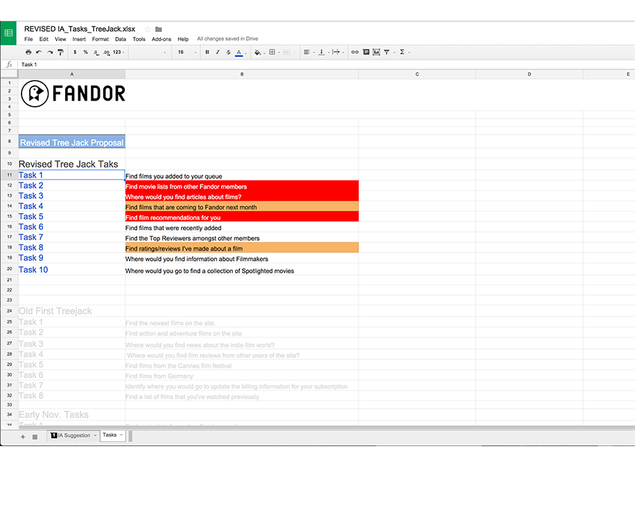
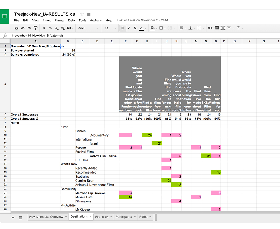
- Task 4: Task for curated area looking for feedback- ask them to find a criterion film, ask them to find more if they only scroll down instead of going to the tab
- Task 5: Task for Recommendation area - find something recommended because of something you watched. where would you find more?
- Task 6: Task for Trending area - find popular films or film review
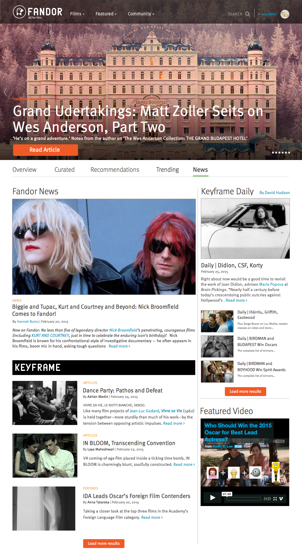
- Task 7: Task for News… provide feedback. Where would you find articles about films or news about our service.
Final Design Delivery
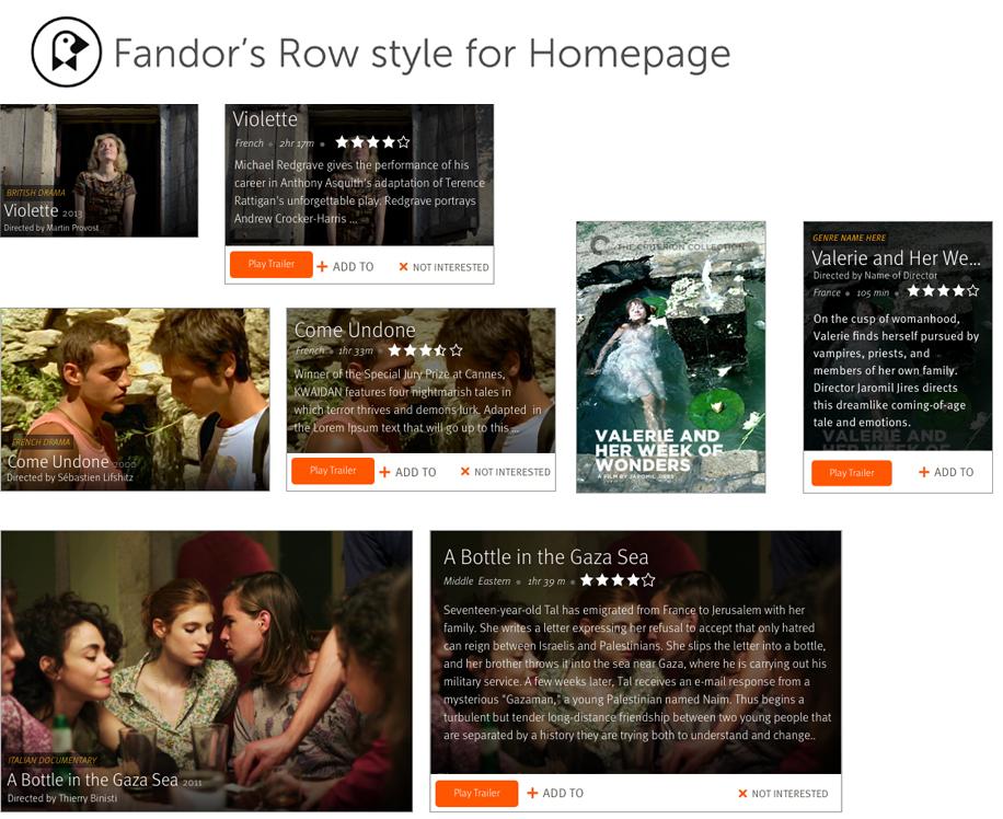
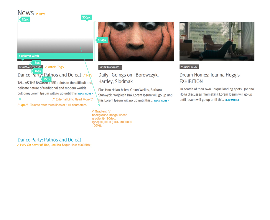
Carousel for Feature Content


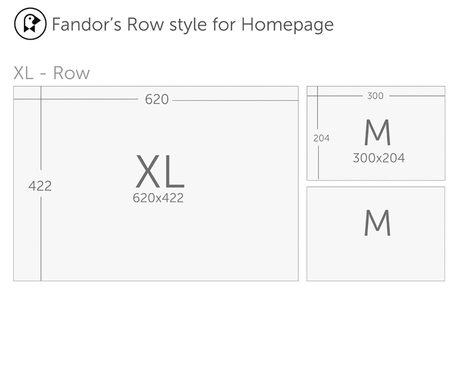
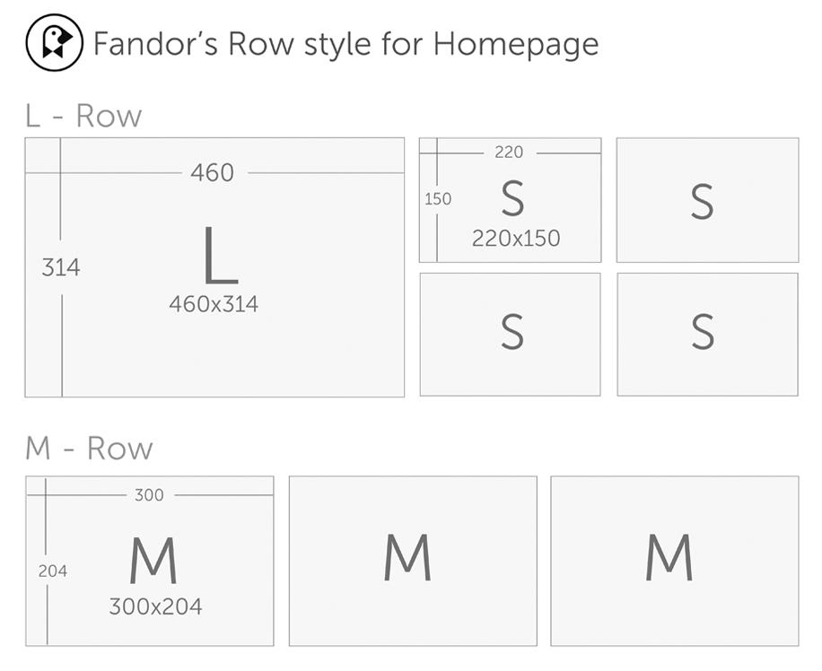
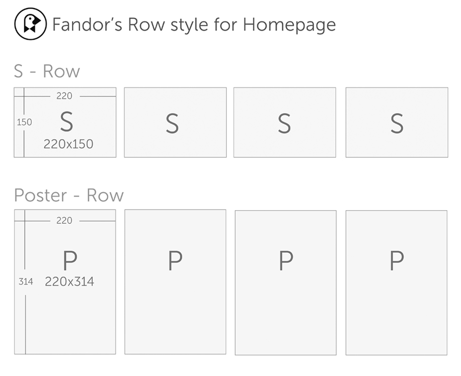
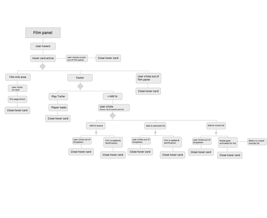
Film Panels Logic and Specs
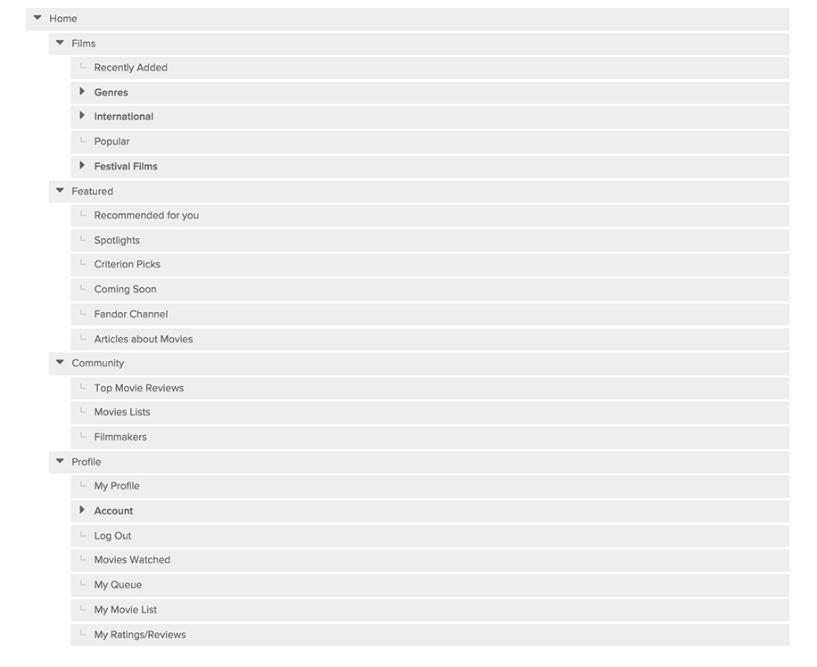
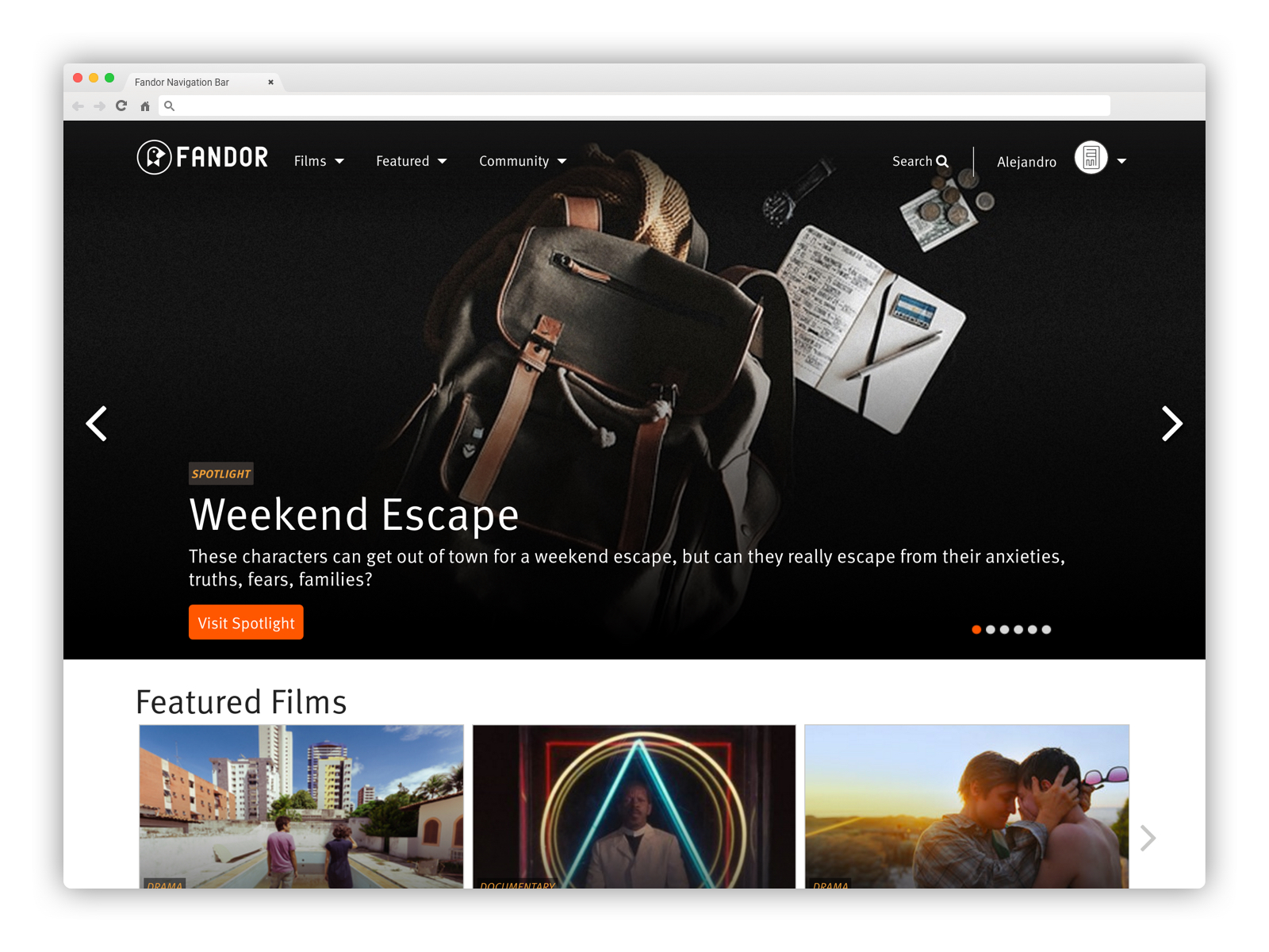
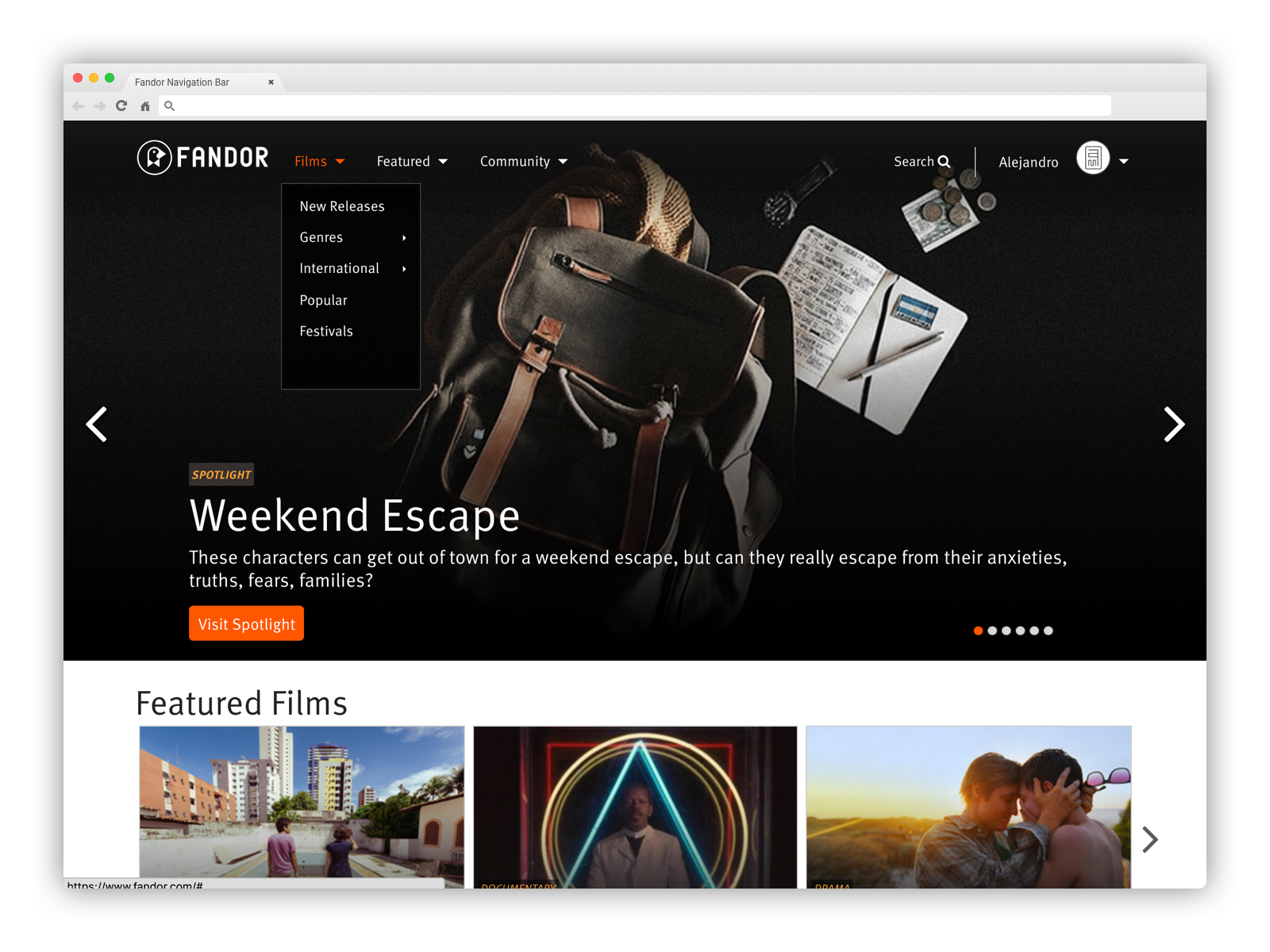
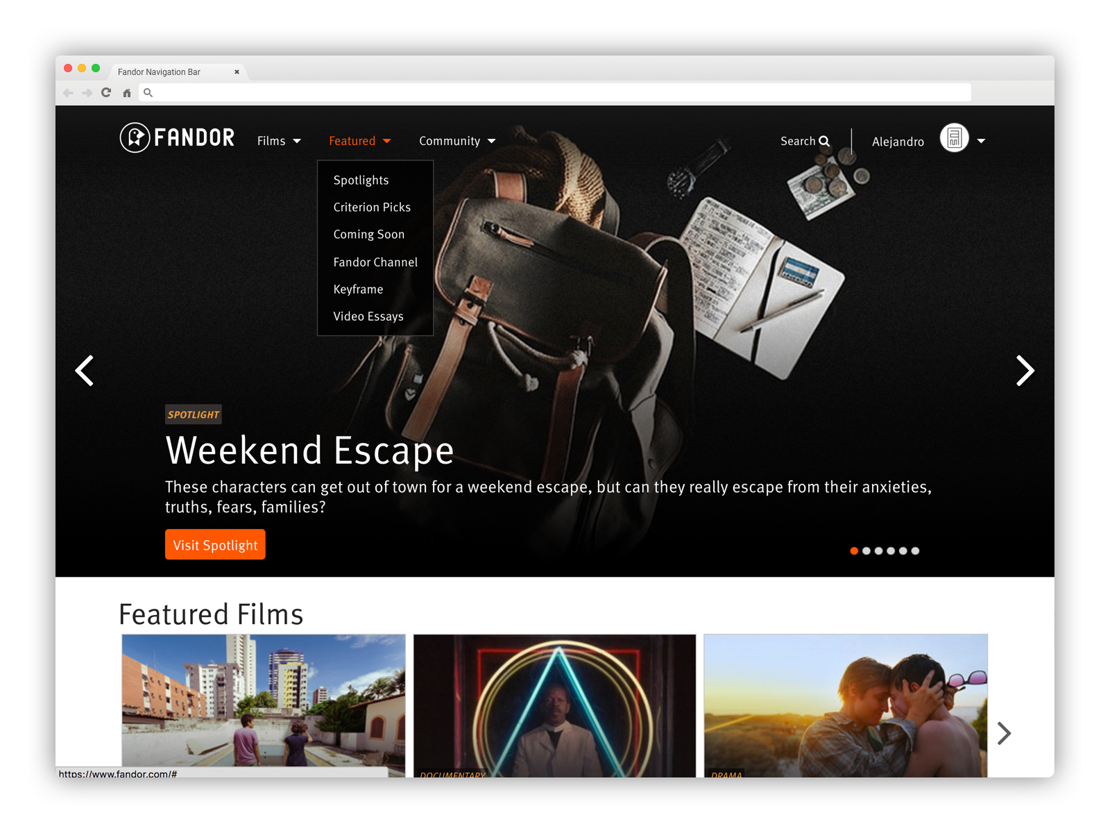
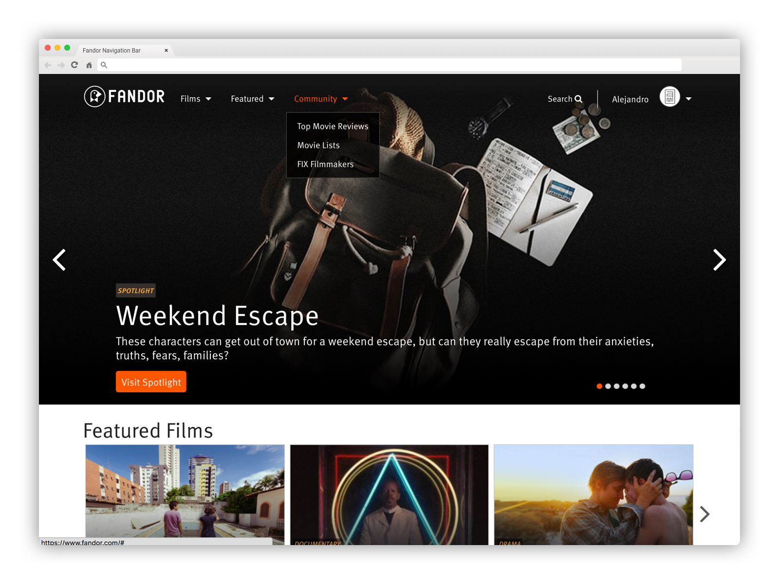
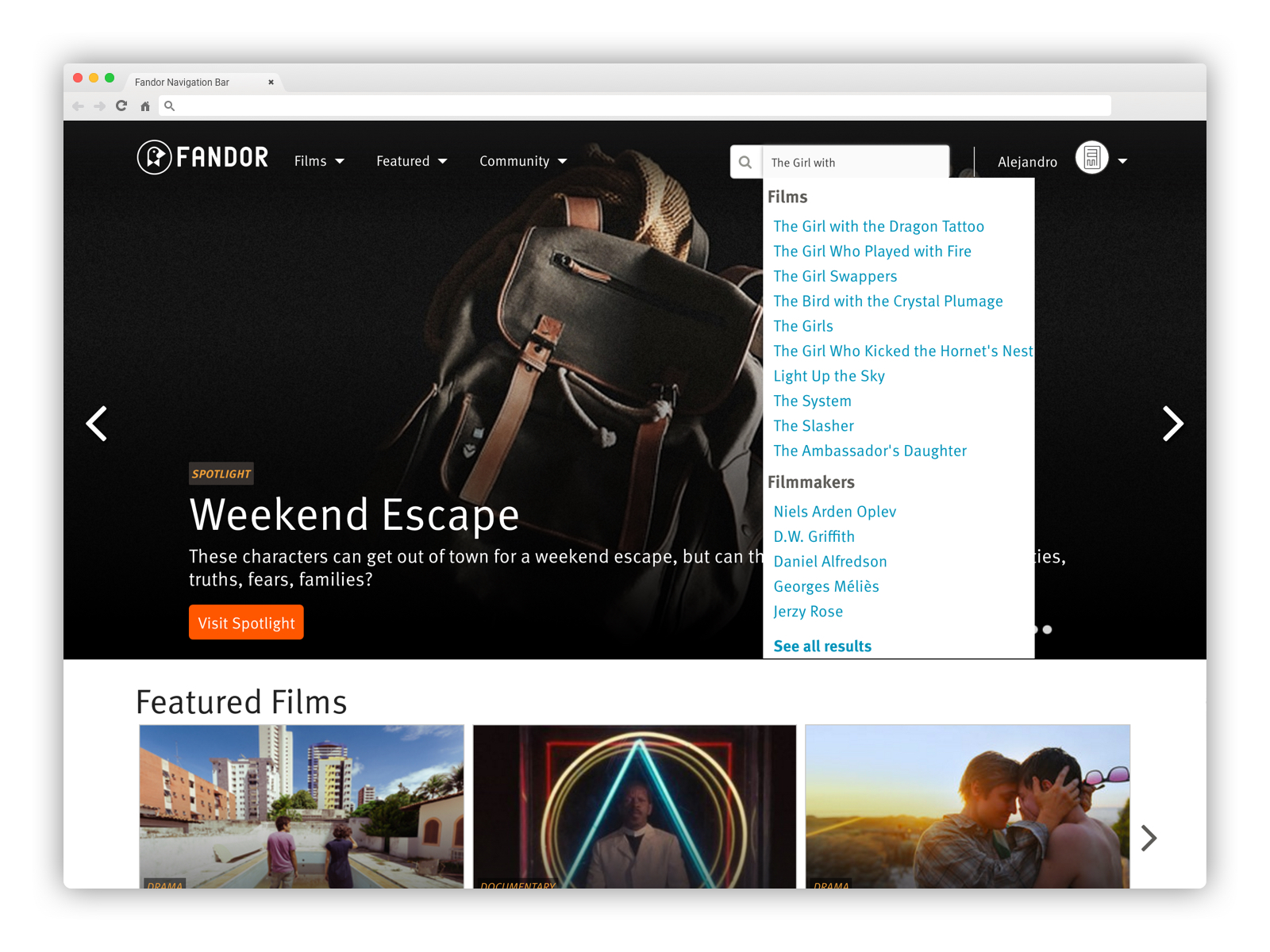
Fandor Navigation Bar
For this project I needed to focus on re-arranging the content while simplifying the user's mental process to find films and other supporting content.
Some of the paint points were: Difficulty finding what I'm looking for, Too much clutter, too busy, lost in the mess.
My goal for the project: Make it easier to find what you’re looking for and Increase registrations.
Research and work
Moderated card sorting exercise to understand users’ needs
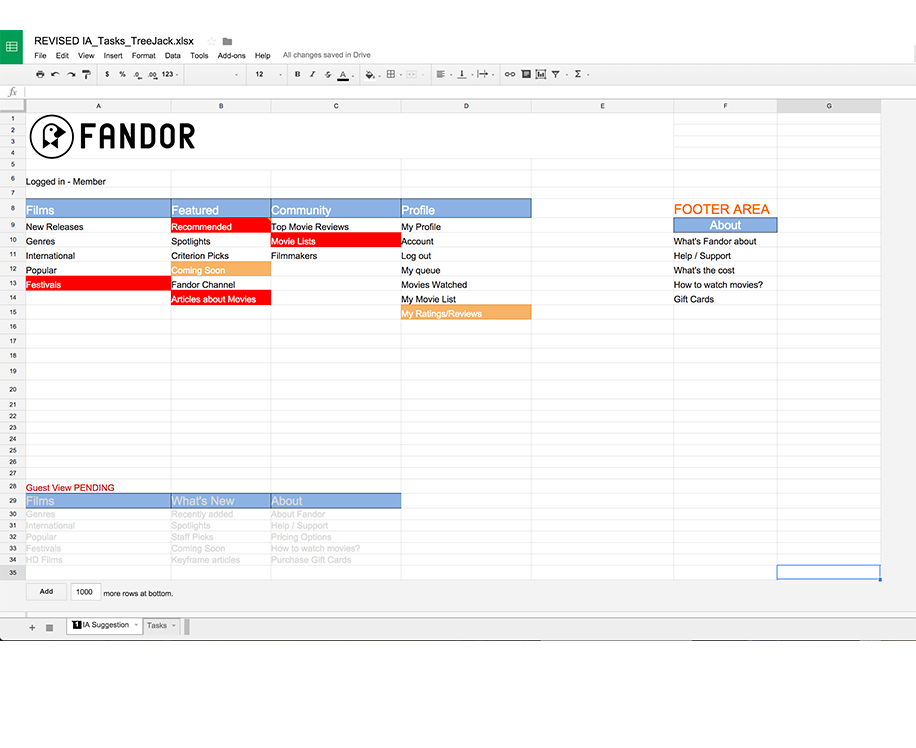
Unmoderated card sorting exercise to come up with new IA
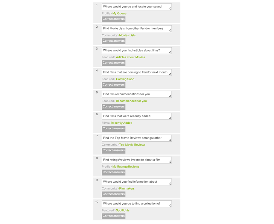
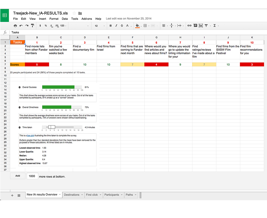
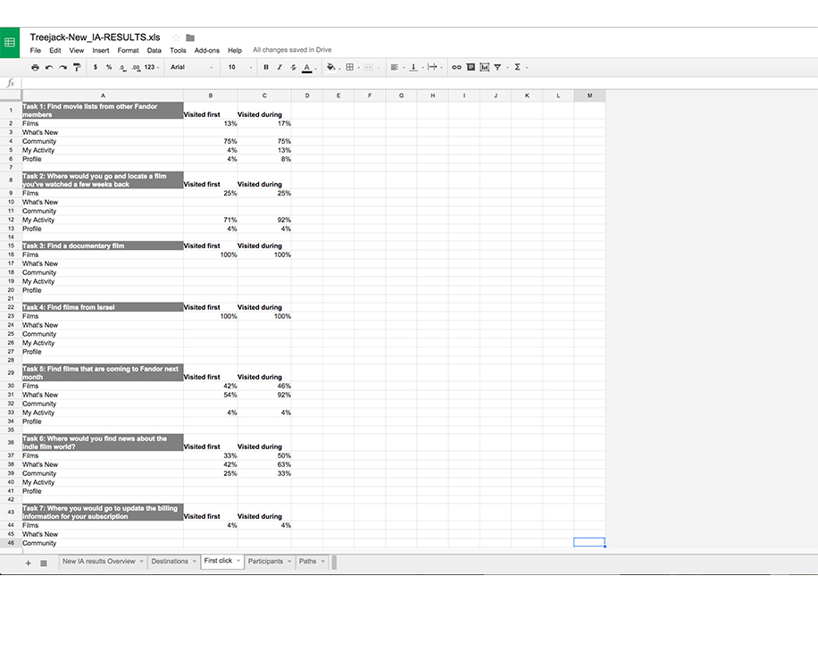
Iterative Treejack test, testing new IA vs. old IA
- Designed prototypes (hamburger and salad bar), in the middle of iterative user testing
Moderated card sorting exercise


Interactive Treejack test, testing new IA performance
Prototype Designs:
Hamburger Menu (Items align vertically)

![fandor_vertical[main].jpg](https://images.squarespace-cdn.com/content/v1/56a056c35a56686ee6b5e873/1453854054657-Y19H2L2JWYI6JP6O9FL9/fandor_vertical%5Bmain%5D.jpg)
![fandor_vertical[main_active].jpg](https://images.squarespace-cdn.com/content/v1/56a056c35a56686ee6b5e873/1453854054957-P6JF45Q8TWFOAC9PCP7F/fandor_vertical%5Bmain_active%5D.jpg)
![fandor_vertical[Films_active].jpg](https://images.squarespace-cdn.com/content/v1/56a056c35a56686ee6b5e873/1453854648426-98MP03L5T25BIQSR39R2/fandor_vertical%5BFilms_active%5D.jpg)
![fandor_vertical[genres].jpg](https://images.squarespace-cdn.com/content/v1/56a056c35a56686ee6b5e873/1453854053619-SH7I60AX6L2UVOXP0LWX/fandor_vertical%5Bgenres%5D.jpg)
![fandor_vertical[international].jpg](https://images.squarespace-cdn.com/content/v1/56a056c35a56686ee6b5e873/1453854054145-8RKJI89HLSO7JTHAZS84/fandor_vertical%5Binternational%5D.jpg)
![fandor_vertical[featured].jpg](https://images.squarespace-cdn.com/content/v1/56a056c35a56686ee6b5e873/1453854053861-07SDA22JN2CF3WITJ2YC/fandor_vertical%5Bfeatured%5D.jpg)
![fandor_vertical[community].jpg](https://images.squarespace-cdn.com/content/v1/56a056c35a56686ee6b5e873/1453854052100-R437OO24DHQBGV1JEUEI/fandor_vertical%5Bcommunity%5D.jpg)
![fandor_vertical[member_Profile].jpg](https://images.squarespace-cdn.com/content/v1/56a056c35a56686ee6b5e873/1453854055162-YLGQLJII8M7BFHCFIAC2/fandor_vertical%5Bmember_Profile%5D.jpg)
![fandor_vertical[search_active].jpg](https://images.squarespace-cdn.com/content/v1/56a056c35a56686ee6b5e873/1453854058036-I0D48VGBKIT0SAHNXACU/fandor_vertical%5Bsearch_active%5D.jpg)
Salad bar (Displayed items in a row system)
![fandor_horizontal[main].jpg](https://images.squarespace-cdn.com/content/v1/56a056c35a56686ee6b5e873/1453854945748-ZQLLHL6TM72200T86QQ6/fandor_horizontal%5Bmain%5D.jpg)
![fandor_horizontal[recently-added].jpg](https://images.squarespace-cdn.com/content/v1/56a056c35a56686ee6b5e873/1453854947082-14LYV4SJIZBDN4E45M3G/fandor_horizontal%5Brecently-added%5D.jpg)
![fandor_horizontal[genres].jpg](https://images.squarespace-cdn.com/content/v1/56a056c35a56686ee6b5e873/1453854944538-AMACAY8XG0Q5EUWGH369/fandor_horizontal%5Bgenres%5D.jpg)
![fandor_horizontal[international].jpg](https://images.squarespace-cdn.com/content/v1/56a056c35a56686ee6b5e873/1453854945131-30PJN48N245WSNT7WBGT/fandor_horizontal%5Binternational%5D.jpg)
![fandor_horizontal[popular].jpg](https://images.squarespace-cdn.com/content/v1/56a056c35a56686ee6b5e873/1453854946894-EZJGDFZT06BXEO1ASVH0/fandor_horizontal%5Bpopular%5D.jpg)
![fandor_horizontal[festivals].jpg](https://images.squarespace-cdn.com/content/v1/56a056c35a56686ee6b5e873/1453854944005-1OFPLZWX78DQ1NAMGWYQ/fandor_horizontal%5Bfestivals%5D.jpg)
![fandor_horizontal[recommended].jpg](https://images.squarespace-cdn.com/content/v1/56a056c35a56686ee6b5e873/1453854948133-1TASXS1IKNT57ERMRE52/fandor_horizontal%5Brecommended%5D.jpg)
![fandor_horizontal[spotlights].jpg](https://images.squarespace-cdn.com/content/v1/56a056c35a56686ee6b5e873/1453854950606-P1S9NP9APICO7V4KL4ZL/fandor_horizontal%5Bspotlights%5D.jpg)
![fandor_horizontal[criterion_picks].jpg](https://images.squarespace-cdn.com/content/v1/56a056c35a56686ee6b5e873/1453854943910-APHPH0A6ZIN8I1X7B7PT/fandor_horizontal%5Bcriterion_picks%5D.jpg)
![fandor_horizontal[comingsoon].jpg](https://images.squarespace-cdn.com/content/v1/56a056c35a56686ee6b5e873/1453854943496-D7DDQWVY3U4OTVXL58FK/fandor_horizontal%5Bcomingsoon%5D.jpg)
![fandor_horizontal[channel].jpg](https://images.squarespace-cdn.com/content/v1/56a056c35a56686ee6b5e873/1453854943298-74YP22GQWV4D0TLMG9FH/fandor_horizontal%5Bchannel%5D.jpg)
![fandor_horizontal[keyframe].jpg](https://images.squarespace-cdn.com/content/v1/56a056c35a56686ee6b5e873/1453854945897-P5AB5ROISZ03BA8B3HZ5/fandor_horizontal%5Bkeyframe%5D.jpg)
![fandor_horizontal[top-reviews].jpg](https://images.squarespace-cdn.com/content/v1/56a056c35a56686ee6b5e873/1453854949256-238PXH3OX2NW0FSY4YAK/fandor_horizontal%5Btop-reviews%5D.jpg)
![fandor_navigation[member_movie_lists].jpg](https://images.squarespace-cdn.com/content/v1/56a056c35a56686ee6b5e873/1453854950214-SFEAW7VIVBATBAOCMMZI/fandor_navigation%5Bmember_movie_lists%5D.jpg)
![fandor_horizontal[FIX_filmmakers].jpg](https://images.squarespace-cdn.com/content/v1/56a056c35a56686ee6b5e873/1453854944637-6CF5UWZFCKAQ5U1O4NH8/fandor_horizontal%5BFIX_filmmakers%5D.jpg)
![fandor_horizontal[member_profile].jpg](https://images.squarespace-cdn.com/content/v1/56a056c35a56686ee6b5e873/1453854946414-E2V85KE3K2MLZUT6WL8X/fandor_horizontal%5Bmember_profile%5D.jpg)
![fandor_horizontal[search_active].jpg](https://images.squarespace-cdn.com/content/v1/56a056c35a56686ee6b5e873/1453854948120-0P1126H8ZRGK7CK98DJI/fandor_horizontal%5Bsearch_active%5D.jpg)
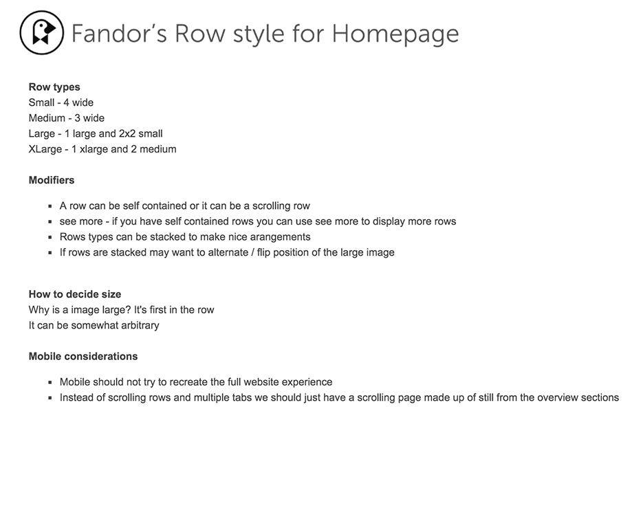
Final Look and Feel
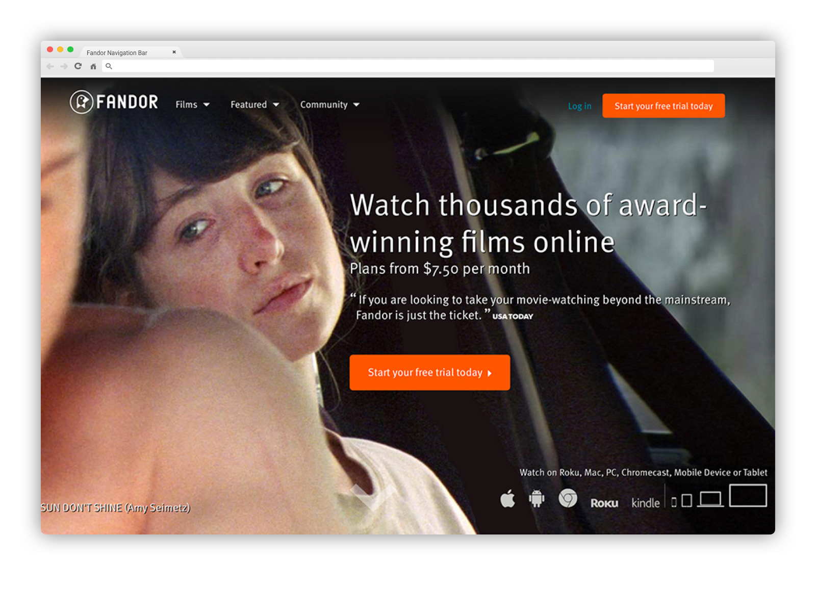


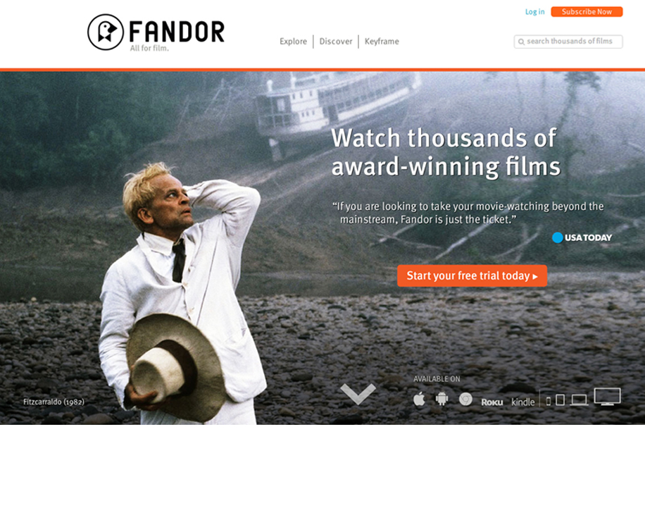
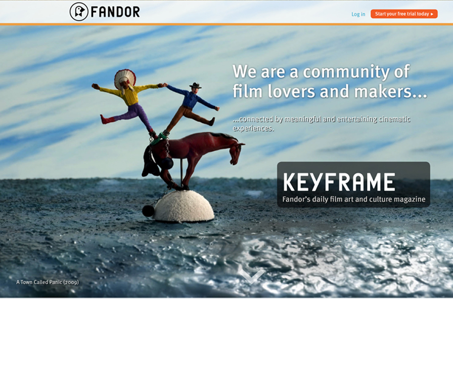
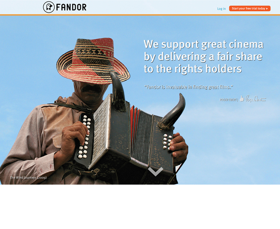
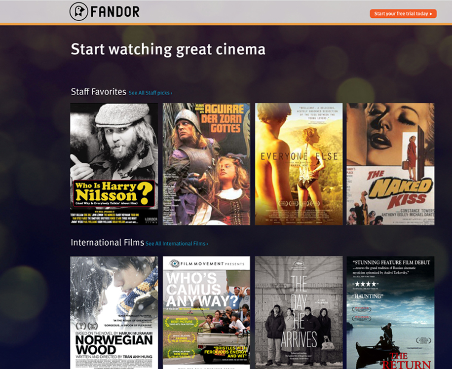
Fador's Guest Landing Page
This is not only a useful marketing tool that helps the user to understand the product but also to find the value proposition quickly.
Fandor didn't have a designated page where User's can glance at the product quickly but also understand what the company stands for. My goal for this project was to provide a range of useful information that a new visitor might want to know about the film, as well as the contextual and taste-making curatorial elements that will let the visitor know whether or not they would enjoy watching the film, and will encourage them to do so.

What did we test?
5 seconds test of our current and new guest homepage designs.
Why?
Get first impression of our new guest homepage design in 5 seconds.
Fine tune our new design and calls to action by analyzing the most prominent elements.
Who did we test?
Primary target audience of the new guest homepage: Brand new users.
What is 5 second test?
Most visitors spend fewer than 10 to 15 seconds on websites. Five second tests help us understand people’s first impressions of our web page designs. By finding out what a person recalls about our web page design in just 5 seconds we can ensure that our message is being communicated as effectively as possible.
How did we conduct the test?
We uploaded a screenshot of our current and new guest homepage designs.
Testers had five seconds to view the mockup and answer following questions:
* What do you think this page was about?
* Did the brand appear trust worthy?
* Which element on the page did you focus on most?
What do you think this page was about?
Result: Good news! Most people associated the new design with place where you could watch movies. This was the primary message that we wanted to communicate.
Did the brand appear trust worthy?
Result: Good news! Yes, most people thought out new design was trust worthy. Being trust worthy is one of the key factors to getting users to register.
Which element on the page did you focus on most?
Result: Good news! People remembered primary photo of the man and free trial button. This was our main call to action!
Usability changes for Fandor's Roku Channel
Lorem ipsum dolor sit amet, consectetur adipiscing elit. Morbi eget sapien sed risus suscipit cursus. Quisque iaculis facilisis lacinia. Mauris euismod pellentesque tellus sit amet mollis. Nulla a scelerisque turpis, in gravida enim. Pellentesque sagittis faucibus elit, nec lobortis augue fringilla sed. Donec aliquam, mi in varius interdum, ante metus facilisis urna, in faucibus erat ex nec lectus. Cras tempus tincidunt purus, eu vehicula ante. Duis cursus vestibulum lorem.